006. Making Stuff / Belt Book Covers
Designing and illustrating book covers!

I just got done working on a few new Belt Publishing book covers and figured I’d spend my time this month writing about the work I get to do for the AMAZING people at Belt. Anne Trubek also wrote about Belt’s book covers this month. I guess the last round of covers has us both wanting to talk about them! It’s been a lot of years doing design work with Anne and Belt and thanks to this substack, I now know I have created a little over 100 covers for them. You can see them all in this quick video I made.
Let’s dive in!
Who doesn’t love a good book cover? Even people who don’t read consistently can appreciate a good cover (unless they don’t have a soul or something). I love that a book cover, no matter how simple or complex the content of the book is, comes down to two things: type and image.
Minimal ingredients.
Minimal ingredients doesn’t always mean the end result is simple. Look at this beautiful cover for The House in the Cerulean Sea illustrated by Red Nose Studio. The color, the whimsy, the beautiful typography sitting against the gorgeous illustration.

Contrast that book cover to this amazing, yet starkly simple, cover for Young Austerlitz (Art Director John Hamilton).

Visuals and words harmonizing together in a rectangle. That’s the designer’s problem to solve—using minimal ingredients that have a SHIT TON of work to do. What work you ask? Hook a reader, tell a story, be interesting, fit into a market, spark curiosity, find a specific audience, consider demographics and locations, be broad, be niche. It has to shine against thousands of other brilliant book covers. Have you seen all the beautiful book covers out in the world? No? Here’s one place to browse just a small selection, The Book Cover Archive.
Also, at least in my case, a cover design has to make it past the editor, the publisher, and the sales team. Not to mention the worst check point of all… my own fucked up, self-conscious brain. Will the book’s success live or die off your visual interpretation? Is the risker concept worth it? If it’s not a risky idea, won’t it just blend in with the crowd? Is that the right color? Typeface? Am I doing justice to the words?
Design can be a very self-conscious thing to do.
To help subdue my worries, I try to find some sort of grounding principle, some mode of thinking that helps me narrow my decision making down and/or provide me with restrictions or boundaries to work within. If I can do ANYTHING, there’s a good chance I won’t actually FINISH anything or feel bad I didn’t do better or as good as the other amazing book cover designers.
So, I ask myself, what does book cover design mean to me? That leads to the bigger question of what does Design mean to me? I don’t have an answer. Just more questions… Are we balancing the commercial with the artistic? Shouldn’t design be authentic to the project? Does authenticity sell? Do I give a fuck if it doesn’t? Should I give a fuck if it doesn’t? Shouldn’t we all try to be more authentic in the things we make, no matter what the results are? Should the design tackle the themes of the book or something more on the nose? Numbers say trends sell, is that the route I should go? Couldn’t my design be the one to create the new trend? Who am I to make these decisions? Am I even good at this? What do I really know? Wait, what is design again?
This is where having someone smarter than me, with more knowledge about the publishing landscape and the books being published, comes in handy. For me, that person is Anne Trubek—founder and publisher of Belt. She’s the best.
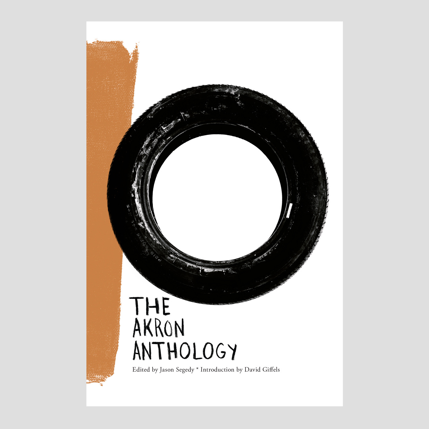
I met Anne when she hired Matt Stansberry and I to do our monthly nature column for Belt Magazine. You can read that story here. While I was illustrating the nature column I mentioned to Anne that I was interested in designing book covers and she offered me the Akron Anthology book cover.
Belt’s anthology books are a collection of writings from local authors with an editor(s) at the helm. It’s pages feature different perspectives from different writers on the location and culture of a city. That’s the beauty and difficulty of an anthology—it’s hard to find a thematic voice to base a single visual on. And, now, I was on the hook to design a book cover that was going to get printed and actually looked at by the people that lived in the city. Sheeeeeit.
This is where a good book introduction is very helpful for a designer like me. The introductions give me a good baseline on what to draw from. One of the sentiments I remember from the Akron Anthology’s introduction was something along the lines of calling Akron beautiful and ugly at the same time. That really stuck with me. Akron is a beautiful place AND has a history and reputation of being discarded and rough. I remembered one of the hikes I want on with Matt Stansberry along a canal and seeing so much trash piled up on the river beds. I had my concept. Find the ugly in the beautiful and the beautiful in the ugly.
So, I went to the river and found exactly what I was looking for—a discarded tire floating in the green murk. Fitting for Akron, the rubber capital of the world.
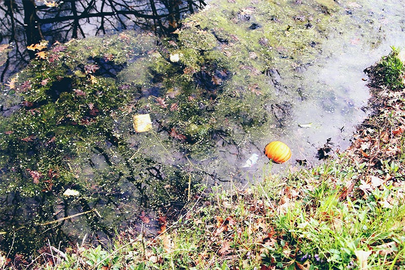
Above: The tire was somewhere in there.
I got into the river and pulled out the tire. I took it home and took photos of it on a white background. The tire, in context of being left in the river, was ugly. But can’t a tire be beautiful? A classic circle in the composition of a rectangle, texture contrasting against smooth moments, the dark tire against its own negative space. I wanted to see if I could use something “ugly” to make a cool cover.
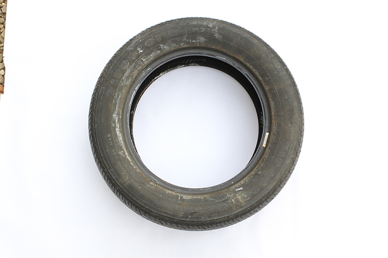
Above: Tire.
To keep with the idea of beauty and ugliness, I did handwritten typography for every chapter title and author. No matter how ugly, I find type done by hand is always beautiful.

Above: Type studies done in pencil on bristol.
And after putting all the pieces together, I had my first book cover.
From there, Anne and I just kept making covers. Our process mostly looks like this…
Anne sends me general notes about the book and her initial ideas and thoughts. Sometimes, I have introductions to help the ideation, sometimes I read the whole manuscript, sometimes there are author notes and ideas attached. I take any and all of those and build them out, adding my own concepts and send back pretty terribly crafted sketches (see images below). In this phase, I’m just trying to get approval on the big idea. I don’t want to spend a lot of time designing or illustrating a concept that won’t work. Getting approval at the idea stage hopefully saves everyone a lot of headache.


Top: Concept ideas for Runaway done on an iPad. Bottom: Concept ideas for Rethinking Fandom done on paper.
Anne and I talk through those initial ideas and narrow them down. Then I iterate until we reach a final. Sometimes that process is complicated—we do a TON of iterations and even variations of full covers then end up trashing them when a new or better idea appears. Sometimes the process is simple and I do one version and it just works!
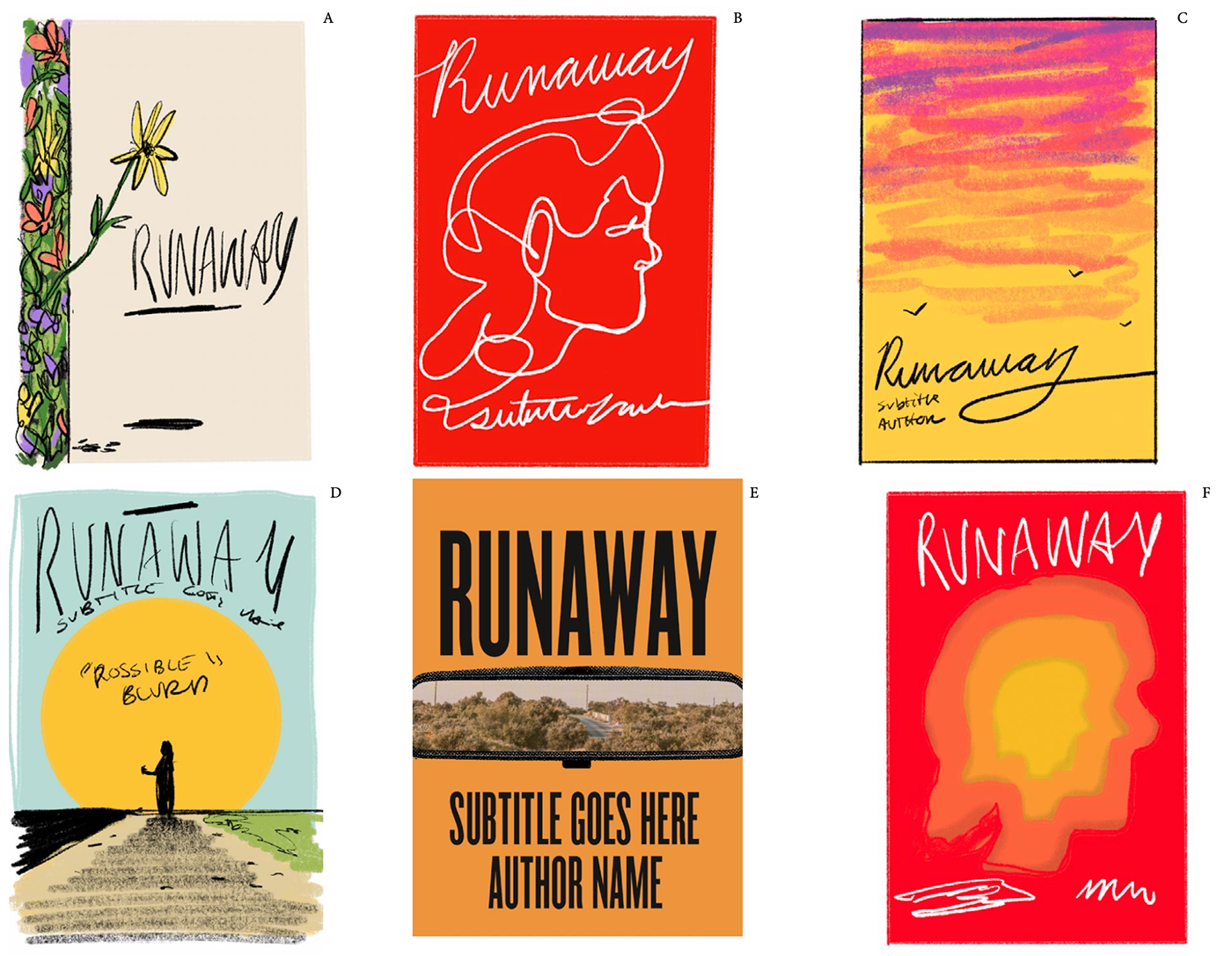

Above: Iterations and studies for Runaway.


Above: Once a general direction or idea is agreed on, I iterate different compositions which include imagery, type placement, hierarchies.
The process is always a back and forth of ideas, experimentations, digging, and iterating.
***
One of our goals when Anne and I started working together was finding an “approach” for Belt books that felt… “Belt-y.” I wouldn’t call it a style and I don’t know what “Belt-y” truly means and I’m not sure Anne does either, but we wanted to find something in the visual DNA of the covers that said this is a Belt book without using templates or brand guidelines. I think we accomplished that but I’m not sure how we did that or what the DNA is. Maybe it’s just the combination of our minds and tastes? Quantifying it feels impossible and intangible.
That being said, some of Belt’s books did start falling into their own contextual umbrellas, so we started coming up with motifs for those books.
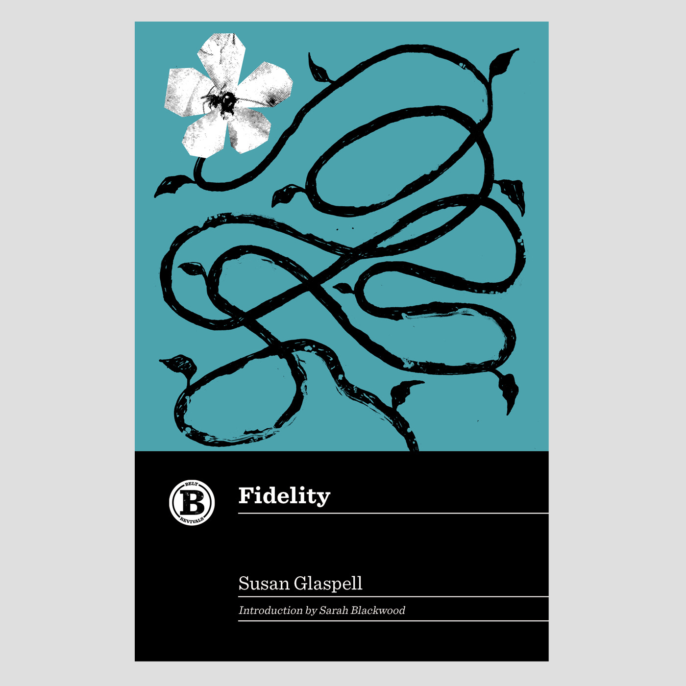
Belt was re-issuing classic books under the Revivals name and we wanted to take a page from Penguin Classics. We threw around ideas on how to make a consistent look for the series but keep each title unique and decided it would be beneficial to use pen and ink illustrations over flat colors to differentiate each book. The decision paid off and we were nominated for AIGA’S 50 Books | 50 Covers.
Although, I did just break out own rules on the last Revivals cover (black line illustrations only) by adding in a splash of white. I love how it looks, so, whatever past David.
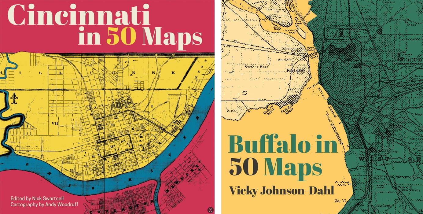
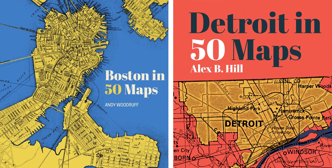
Our maps books don’t have templates like Revivals, but we always use a historical map with a specific typeface. The design of elements and color choice is never rigid but guided by what maps are available focusing on interesting compositions and showcasing the beauty of the vintage maps.
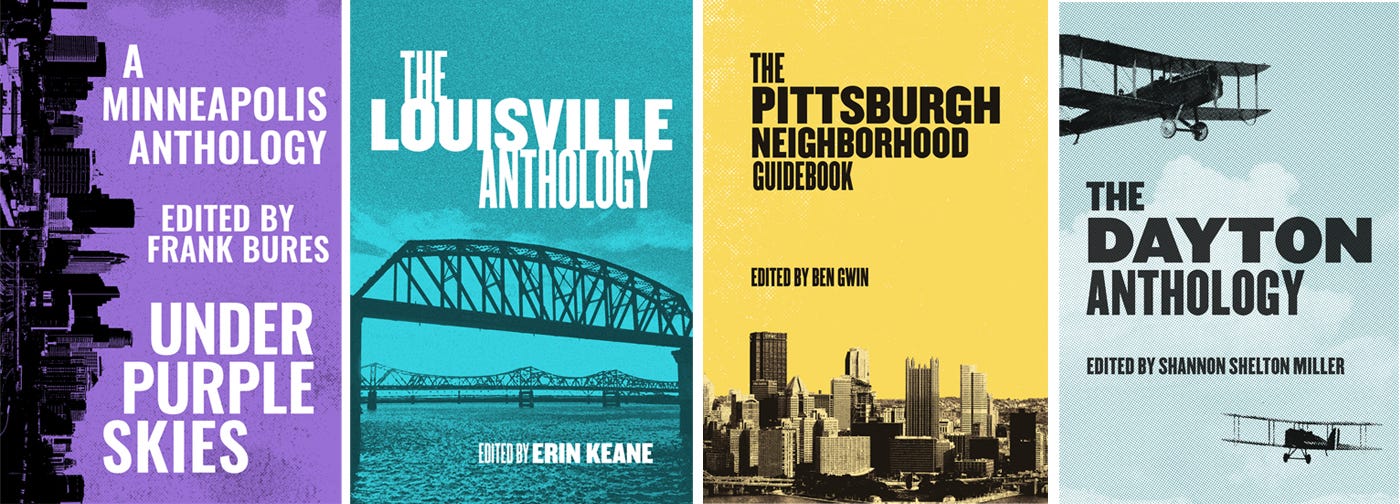
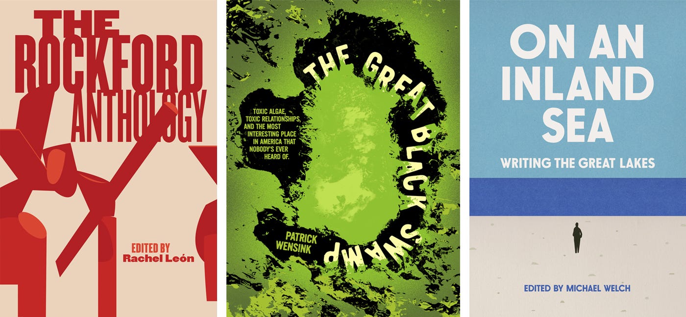
Our city anthology books utilize a lot of photography or visuals of the cities, usually against one color. Again, these book covers can’t be TOO specific because the topic of a city is broad and the content is specific.
Thinking about the other Belt books, I realized there are a few different ways they are tackled—although, nothing is ever prescribed before considering the content and context of the book.
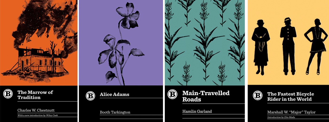
There are covers that are heavily illustrated…
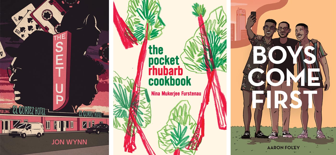
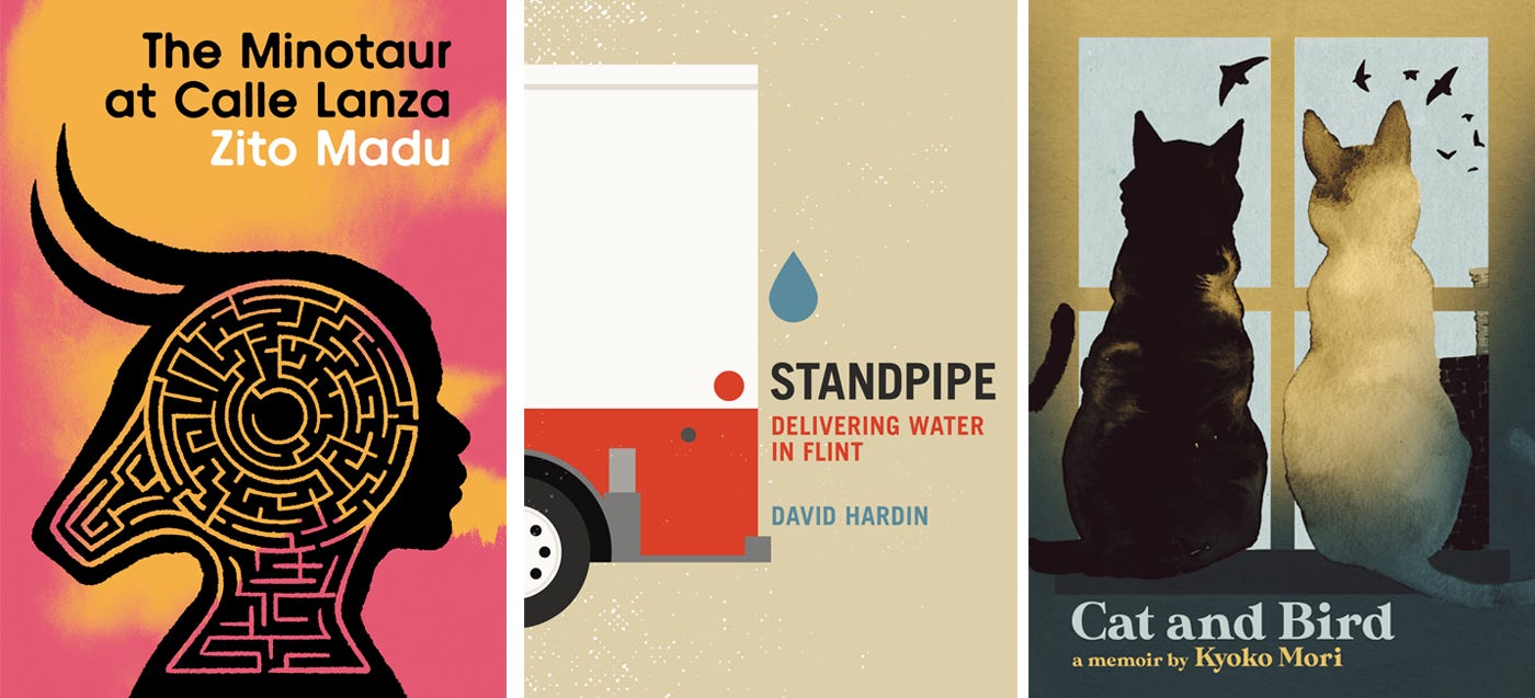
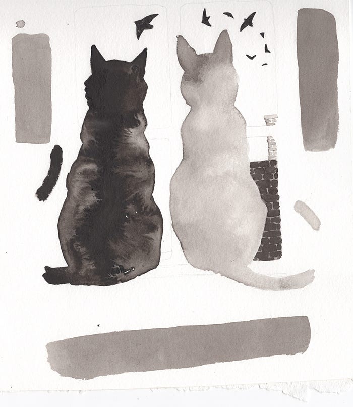
Above: The Setup illustrated digitally. Rhubarb Cookbook illustrated with colored pencils. Boys Come First illustrated digitally. The Minotaur at Calle Lanza illustrated digitally. Standpipe illustrated digitally in illustrator. Cat and Bird illustrated using watercolor and ink wash. Below: Cat and Bird illustration.
There are covers where typography carries the visual burden…
Some covers are handled using poignant and beautiful photography…
Other books have themes and content hard to nail down visually or need a new visual take, so, we use abstract symbols and shapes to get the message across.
***
Little Case Study
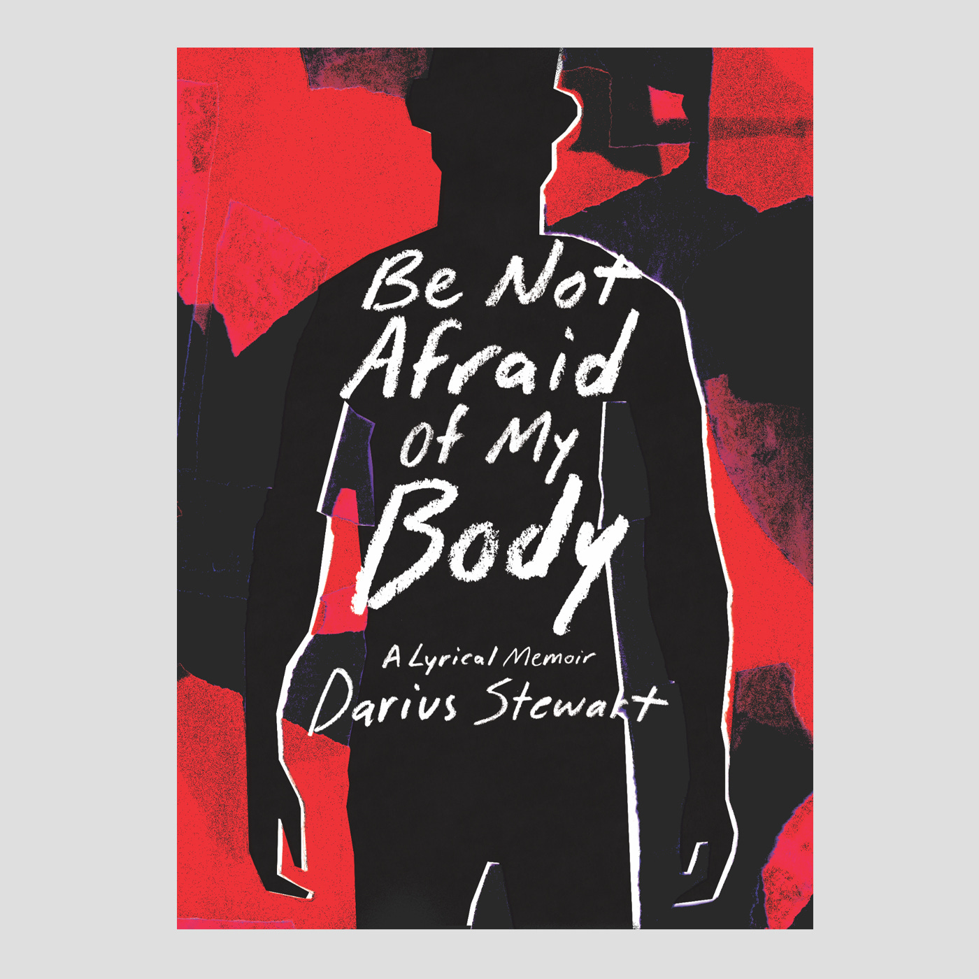
Be Not Afraid Of My Body by Darius Stewart.
“Darius Stewart spent his childhood in the Lonsdale projects of Knoxville, where he grew up navigating school, friendship, and his own family life in a context that often felt perilous. As we learn about his life in Tennessee―and eventually in Texas and Iowa, where he studies to become a poet―he details the obstacles to his most crucial desires: hiding his earliest attraction to boys in his neighborhood, predatory stalkers, doomed affairs, his struggles with alcohol addiction, and his eventual diagnosis with HIV. Through a mix of straightforward memoir, brilliantly surreal reveries, and moments of startling imagery and insight, Stewart’s explorations of love, illness, chemical dependency, desire, family, joy, shame, loneliness, and beauty coalesce into a wrenching, musical whole.”
I’m really proud of the cover we came up for Be Not Afraid Of My Body. I remember reading the initial notes that mentioned loneliness, emptiness, searching, pain, discovery, and this idea of figuring things out. The book had layers upon layers.
I didn’t do a lot of sketches for this book because I had this idea that I wanted to show a body using the negative space of the figure to imply emptiness/loneliness/a void. I also wanted to indicate how layered the story was with themes so went with transparent vellum. I ripped up a few different colors of vellum and started building layered, textured edged space around the shape of a body.
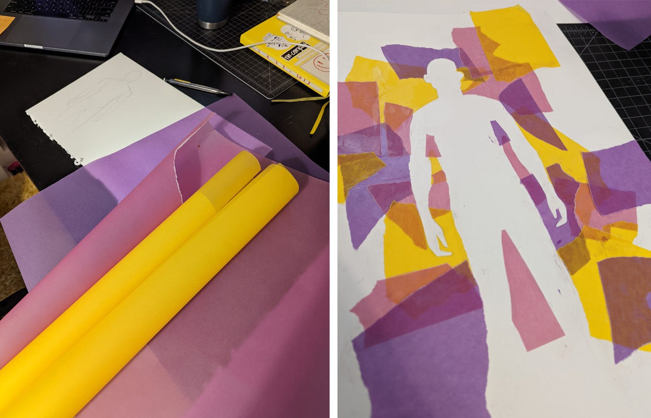
The first iterations were to realistic. Should the body be muscular? Skinny? Accurate? I didn’t want to make a realistic person, I wanted to imply humanity. So, I abstracted the figure more. Originally, I set the title with a sans serif typeface but it felt cold and static against the ripped paper and abstracted figure. Back to the old hand done type to add another layer of humanity.

We did a bunch of color variations but nothing had the right feeling. We got some feedback from the author noting aesthetics of the aids epidemic (using darker colors, reds and blacks) and I did a few more rounds of colors.
And we were done!
***
I’m super grateful to have worked with some really brilliant people over my years at Belt—Anne Trubek, Meredith Pangrace, Bill Rickman, Martha Bayne, Dan Crissman, Michael Jauchen, Phoebe Mogharei, and Julie Foster. I love working with people smarter than me. They make ME smarter and better at what I do. It’s like a sport… If you play with people who will destroy you in the game, you are sure to get somewhat better than you were—you have to! The same goes with creative collaboration. I want to mix minds with people who know more than I do. People who have ideas that get my brain sparking. Hopefully, I’m bringing something to the table that makes their brains spark too!
Making Stuff.
Like I said, I finished up some new Belt covers.
I’m still working on pencils for the next middle grade graphic novel with Misty!

I’ve been traveling a little bit with the fam—from the sandy beaches of North Carolina to the city of NYC. Next stop Florida for Grandma’s 99th birthday (wow!), camping on Middle Bass Island on Lake Erie, and Kentucky for Misty’s book event with the oh, so funny, Lynn Painter.

Sharing Stuff.
Listening.
I’ve been blaring Ceremony Rhonert Park in the studio and Dead Prez’s RBG in the car for these road trips.
Watching.
I’ve also been gearing up for a new project so went back and re-watched The Texas Chain Saw Massacre. As my good friend, Matt Naylor, of Monster Kid Media says… “you can smell that movie.”

Reading.
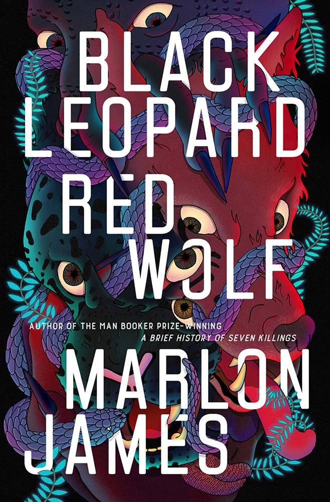
I re-started (forget why I stopped) Black Leopard Red Wolf by Marlon James. I actually grabbed this at a bookstore because I loved the cover (read the back matter and was sold). I’m only a few chapters in but wow this book is lyrical and magical and mysterious and weird and surprising.