


003. Making Stuff / All Teeth Zine
March Recap

Hello, again!
The weather is warming (in spurts) and March has completely flown by (I know it’s not over but might as well be…).
Okay, let’s get into this month’s topic...
All Teeth Zine
There are two formats of media I find to be perfect. The first is film. At its best, film combines so many things I love into a single experience. Film has the words—story and dialogue. It has the visual component—composition, color, and lighting. There is movement and pacing through editing and blocking. It's got graphic design—title sequences, posters, and marketing collateral—as well as performances, stage design, costume design. Sound—with amazing foley, soundtracks and scores… It's all there, wrapped up in one single format!
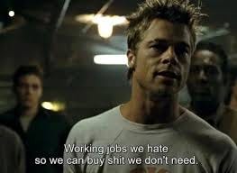
The second medium I find to be perfect is the magazine. It also combines things I love into a single experience—pacing, writing, photography, illustration, design, and typography. Some magazines even come with complimentary smell! (You know those perfume or cologne swatches I'm talking about.) Flipping through a magazine has always been a magical experience for me. Even the advertisements can be something to wonder at (especially in Thrasher magazine)—beautiful photography, sometimes funny copywriting, interesting concepts all to sell us "shit we don't need."
While seemingly simple and easy to toss in the trash, magazines are brilliantly complex and allows the publisher and reader to get very layered, creative, and in-depth with the subject matter.
I also appreciate the production of both film and magazines. Both require a group of people working toward one single deliverable. There are so many hands in the pot, so many collaborations, and so much trust between parties—publisher, editor, writers, photographers, sales teams, illustrators, and designers working together to make a single piece of art with incredible layers. I love it.
Take a peek at this video (linked below) on the production of Little White Lies (a gorgeous magazine about cinema). It's incredible the amount of work that goes into a single issue and a beautifully edited video.
Little White Lies - How to make a print magazine
I love magazines so much that at the end of my college career as a design student at Kent State I wanted to be a magazine designer. My senior project was to redesign a magazine. I chose Discover magazine because science is cool, and I thought I could take the design of the magazine in a different direction. It was as great as I imagined it would be. I loved building the broader housing system, art directing the photography and illustrations, and building the type language. I loved reading the articles, learning about new stuff, and filtering that information into visuals.
Maybe I fell in love with magazines because I loved the comic book format as a kid. (Insert old man's voice) Back in my day, we would go to the grocery store, grab a comic book from the magazine shelf and read it while our parents shopped. Maybe it was the proximity of the comics to other magazines? Or maybe it was just the early magazines of my youth—Wizard and Circus. Where else could I see so many superheroes and rock stars (with fold-out posters!)
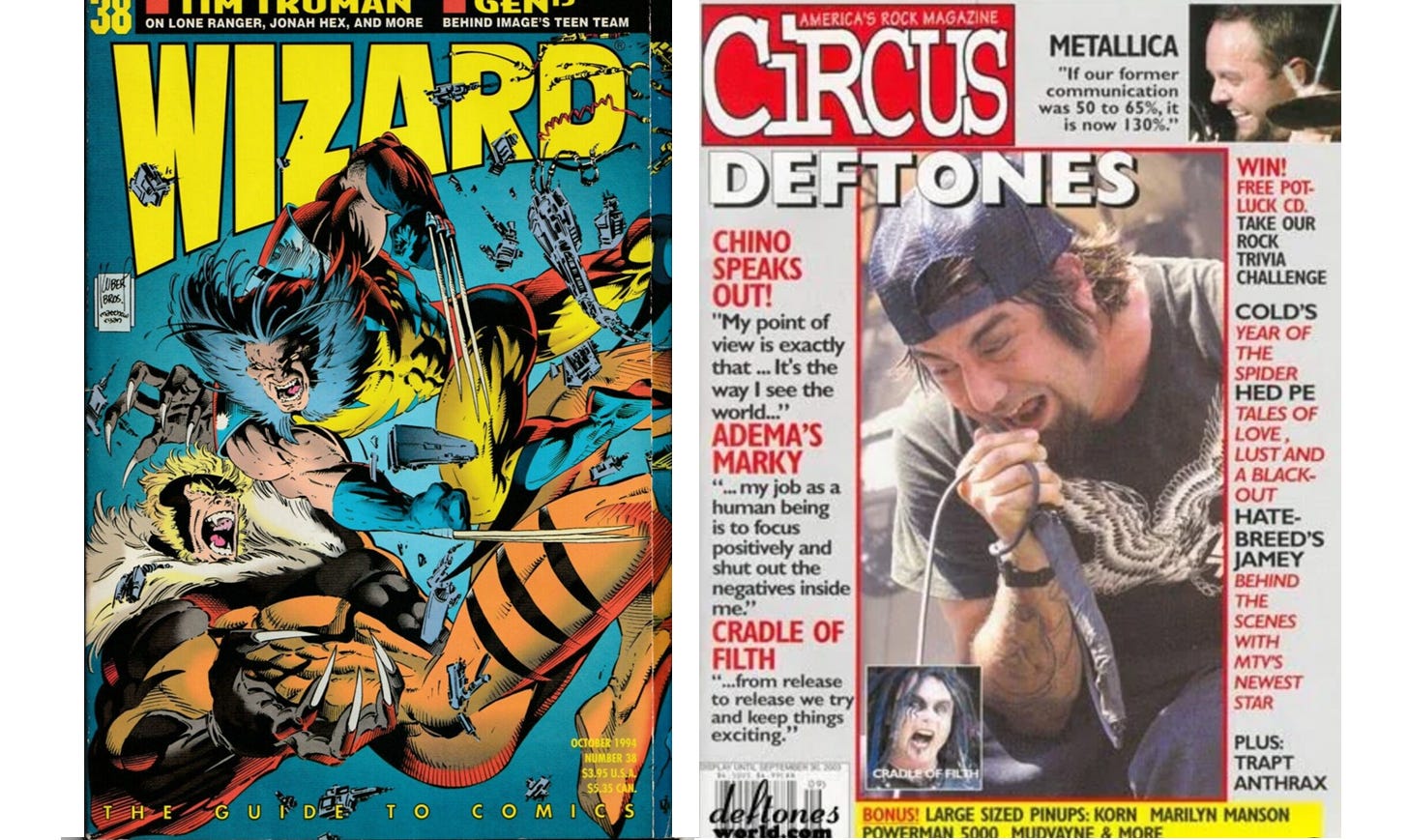
Wizard magazine and Circus magazine.
After college, I wasn't in a spot (or too keen) to move to NYC where all the magazines were being made. Remote work wasn't what it is now, so being a magazine designer in Ohio seemed far-fetched. BUT… I did grow up in the local punk scene, so of course, the next best thing to working for a magazine would be to make my own.
Enter zines.
I figured I’ll just make my own zine. But it couldn’t be ANY zine… I wanted to make/design something editorial and layered. It was possible, right? I had creative people around me, the network, if you will. I had friends who were writers, photographers, illustrators, people with opinions!
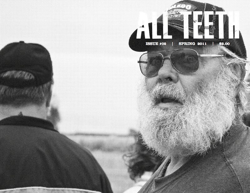
So, I started ALL TEETH zine.
Most of the zines I was buying were music-focused or covered a single artist’s work. I wanted to make something more like Esquire or GQ with different sections covering different a variety of topics. I wanted it to feel more like magazine content rather than singularly focused… like the magazines I was reading and the journalism I found interesting.
I worked with a writer friend of mine, Dane, to start our first issue. We layered it with different topics and articles and decided our feature article would be a story on a local wrestling group. Dane wrote the main article about a local wrestling group, and I attended the event and did photography. We had other friends write book reviews, conduct interviews, contribute recipes, write short stories and poetry, illustrate articles. It was a pretty expansive issue.
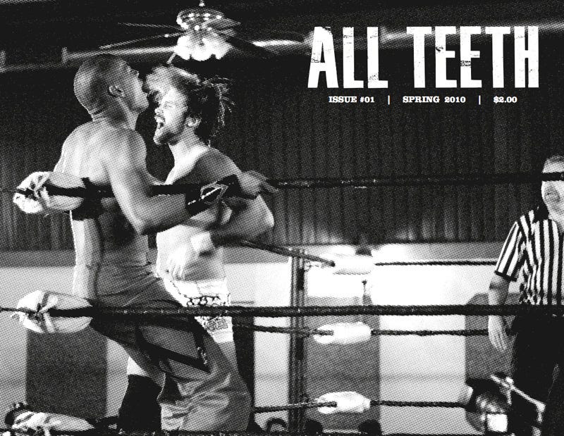
Cover spread for issue 01 featuring local wrestlers in Cleveland, Ohio. Cover photography was half-toned for screen printing purposes.
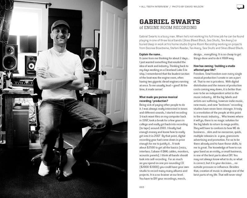
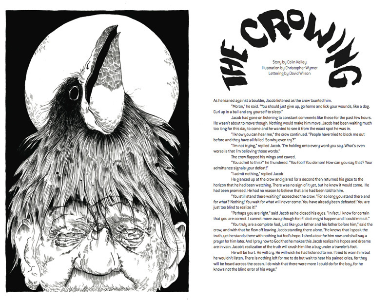
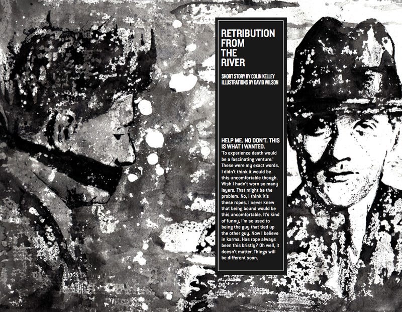
Above: Interior spreads featuring local artist interviews, short stories, poetry, illustration, and photography. The Crowing illustration by Christopher Wymer. Retribution from the River illustration by David Wilson.
I also wanted to make the zine cool and high-end, BUT I wanted the zines to be cheap—because the zines I got were cheap! We did black and white interiors, and I screen-printed the covers on thick paper from the local paper store (shout out to Hollo's Paper Craft in Brunswick again). We charged two bucks per issue (the exact cost to make one of the zines). I didn't have a saddle-stitch stapler, so I would use a thumb-tack to punch holes through the zine, push the staples through, and hand bend them.
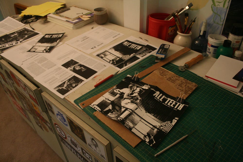
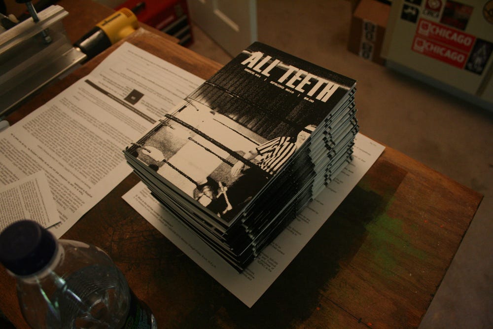
All Teeth Zine issue 01 production. Above: staple holes/binding production in apartment studio. Final booklets assembled.
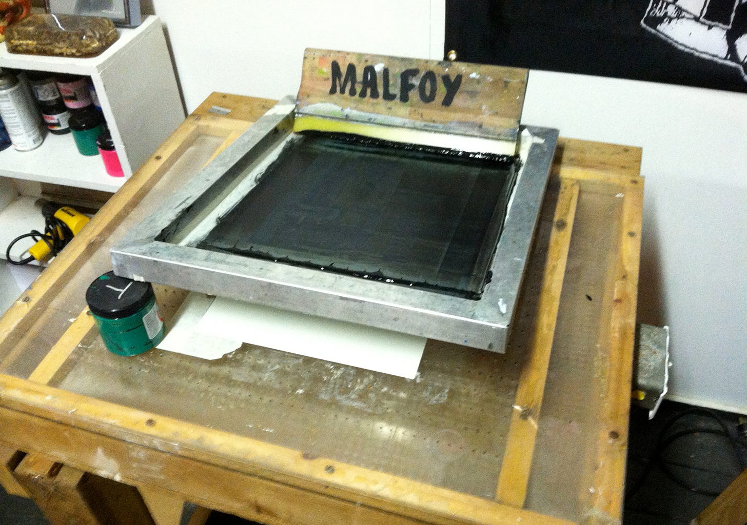
Screen printing the covers.

You have to name your squeegees, people…
We had a release party/concert at the Euro Gyro in Kent, where my band played and sold 50 copies. It was awesome. We sold out of copies that night and had a lot of excitement going into our next issues. Thinking about how to handle the content for the following issues, I applied loose themes to give our creative friends something to get going.
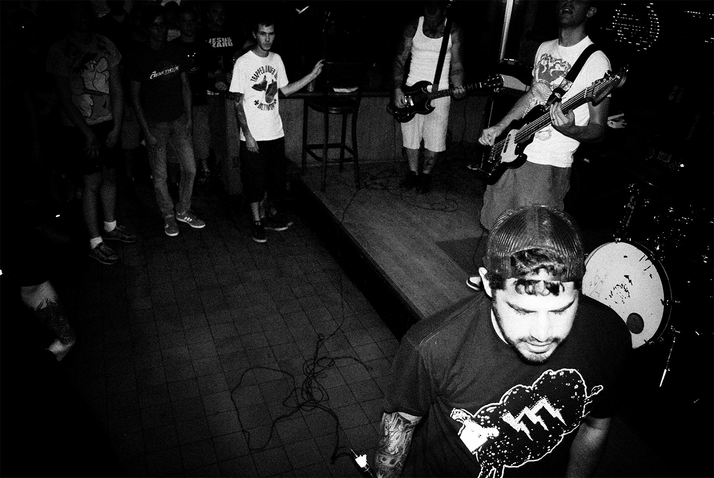
Above: Release show at local bar. Photo by Misty Wilson.
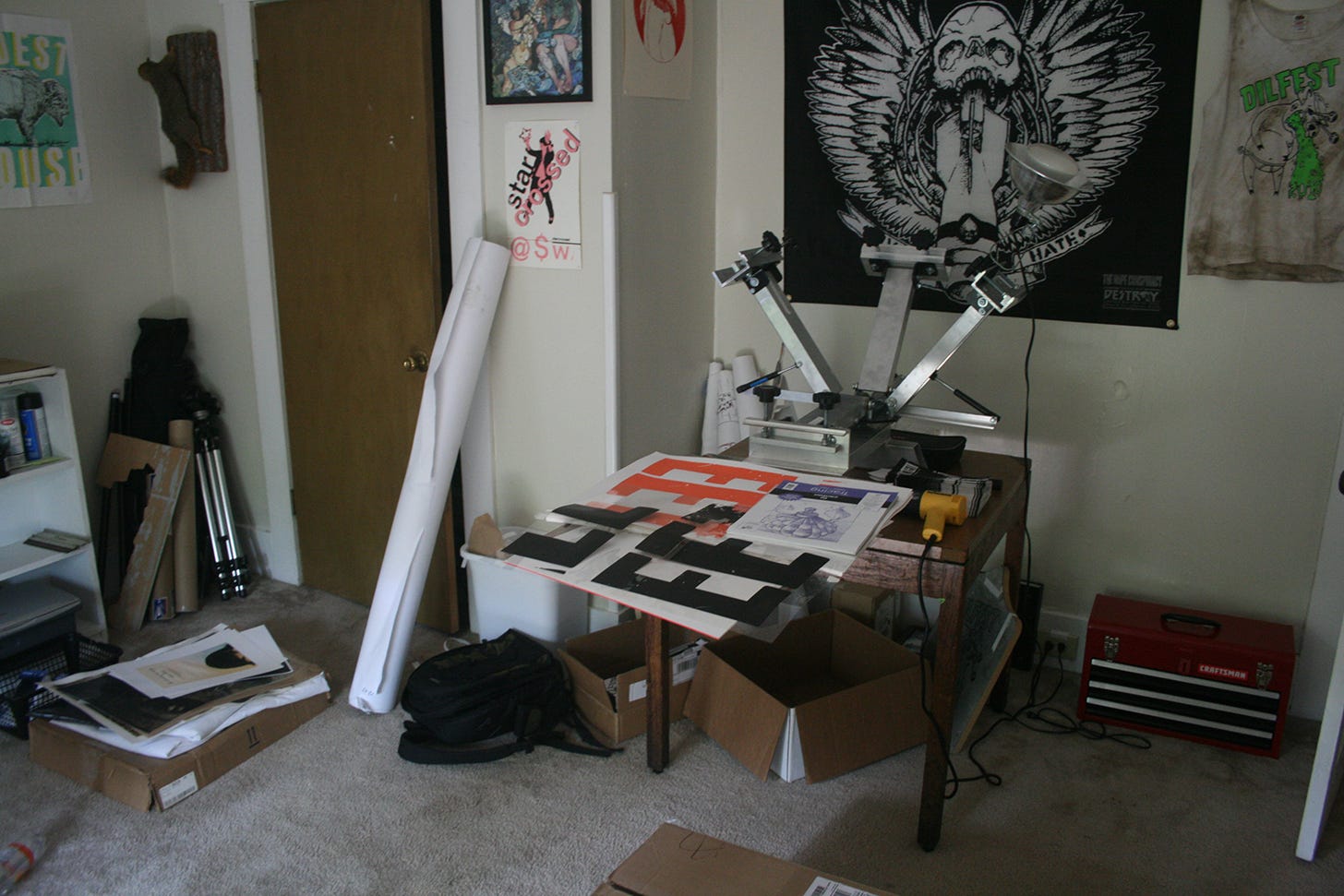
Above: Screen-printing station for covers and release show print. Release show screen-printed poster on wall.
Our second issue was the same page count as the first (24 pages) but our third issue got way larger (nearly fifty pages). I assigned the theme “travel” to the All Teeth network and our main feature stories had to do with band tour stories. I reached out to band buddies and got hilarious stories from bands like Run Devil Run, Sweetheart, Starcrossed, and The Kilroys. Other writers wrote about their travels in other countries, where they relocated to, and I did a sketchbook feature from my travels to Las Vegas on a business trip (where I got to meet Penn Jillette).
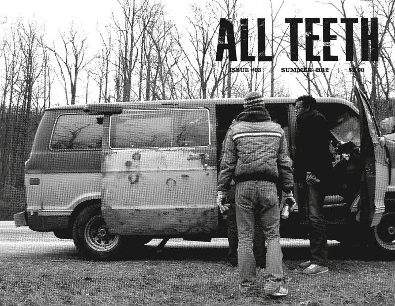
All Teeth Issue 3: Travel featuring an image of Sweetheart’s band broken down on the side of the road.
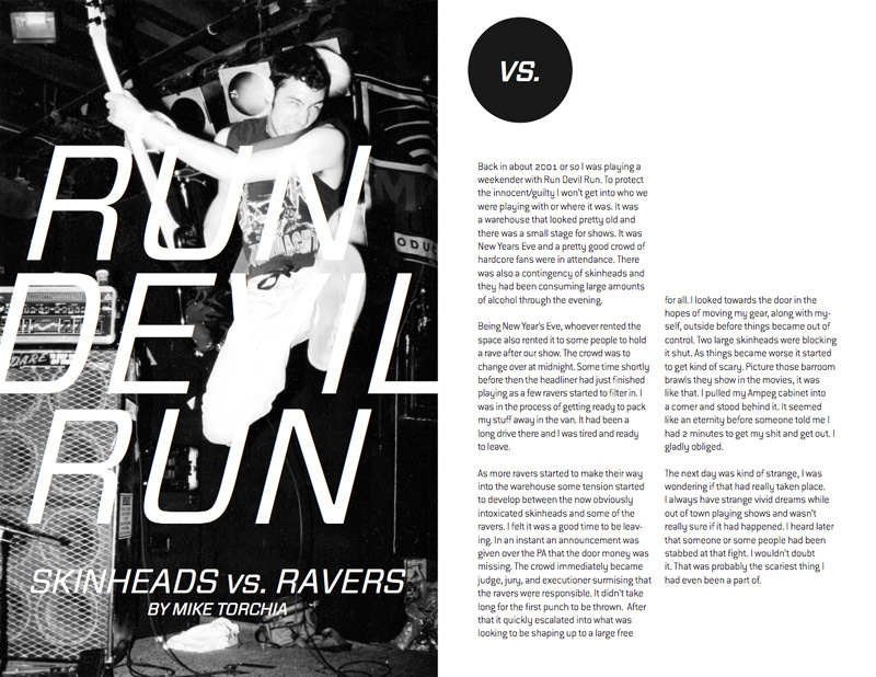
Interior spread for Issue 3 of a story by Mike Torchia of Run Devil Run.
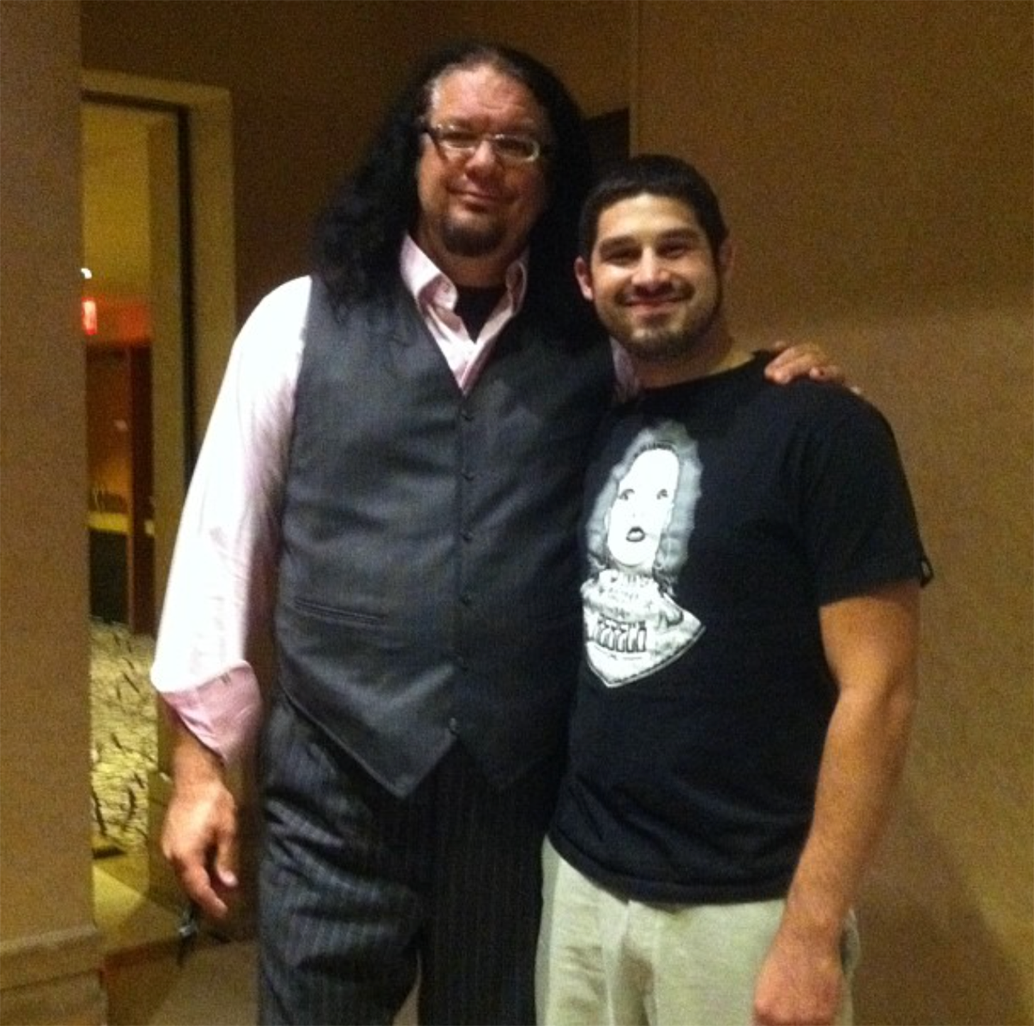
Me and my best friend Penn.
Eventually, it became harder and harder to coordinate the content—people grow older, time becomes scarcer, jobs, responsibilities, blah blah blah.
Our fourth issue was pretty bare and mainly revolved around my editorial contributions. I wanted the zine to be more than just me. It was supposed to be a group activity. But finding people to contribute was time-consuming, and I wasn't in a band anymore, so there was nowhere to sell the physical copies where groups of people would be. Thinking about doing a digital version of a zine didn’t feel right, so that was that.
Queue sad violin music.
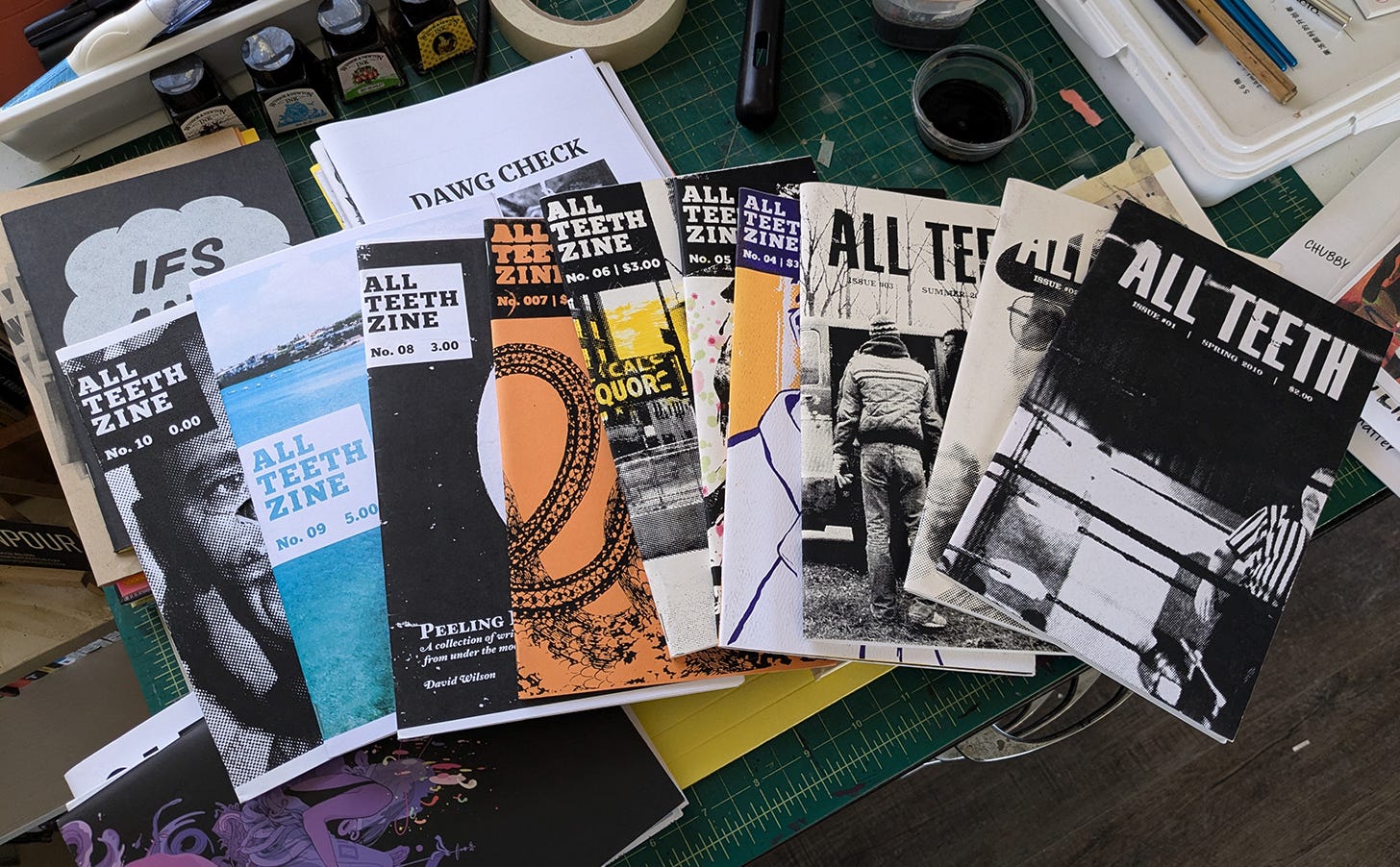
Above: All issues of All Teeth Zine.
I made ten issues in total (but only four met the standards of the zine I had in mind when starting). The later issues were based solely on my illustrations or photography and I labeled them All Teeth, but I did those issues just for something to do, to keep active and producing. I either gave them away to friends or printed just enough for them to sit on a shelf in my studio as dusty relics.
It didn't feel the same. It felt like cheating.
Above: All Teeth covers. Screen printed using one or two colors on heavy card stock.

Issue 05 was a screen printed cover but I watercolored all the pages differently so each one had a different look.
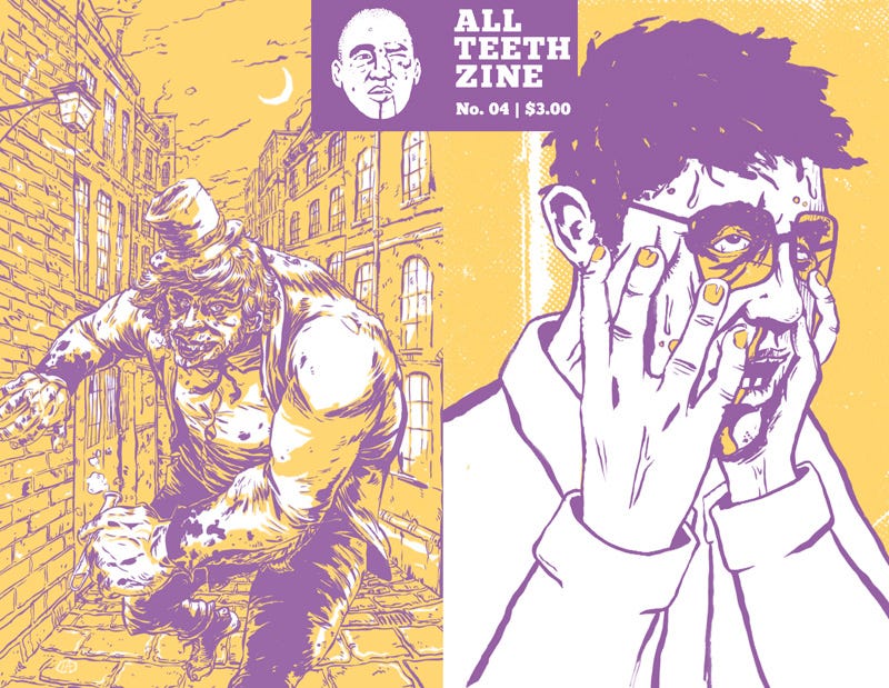


Issue 04 (purple and yellow) had screen printed interior covers as well. The theme was “Change” so we made covers based on Dr. Jekyll and Mr. Hyde - I illustrated Jekyll on the cover, Chad Lewis illustrated Hyde on the back. Christopher Wymer illustrated Jekyll on the interior cover spread and Lou Barberio illustrated Hyde on the back interior.
So, what’s the point of writing about a failed zine?
Looking back, the point is making the damn thing. TRYING to make a thing. It was the curation of ideas and articles. It was having a goal and executing it. The amazing end result that can be accomplished when multiple people come together and make something. The point is ink on the paper. The written word shared outside a digital space. The collection of multiple people’s art.
I still get zines from friends and students every now and then. They are a cherished possession of mine. Some are high-end and fancy (looking at you Matt Stansberry) and some are lo-fi made out of one sheet of cut paper (looking at your Rose). Taylor, AKA Uncle Howie, puts out a zine now and then and mails it to me—it’s my favorite mail day. My students make them for fun or in class. I'll pick up copies up at the best comic/zine fest around—Genghis Con in Cleveland. I'll order them from artists or photographers I find here and there. Sometimes, a record store will carry some (I've found a few at Square Records in Akron, Ohio). I love them all the same—mostly because they exist.
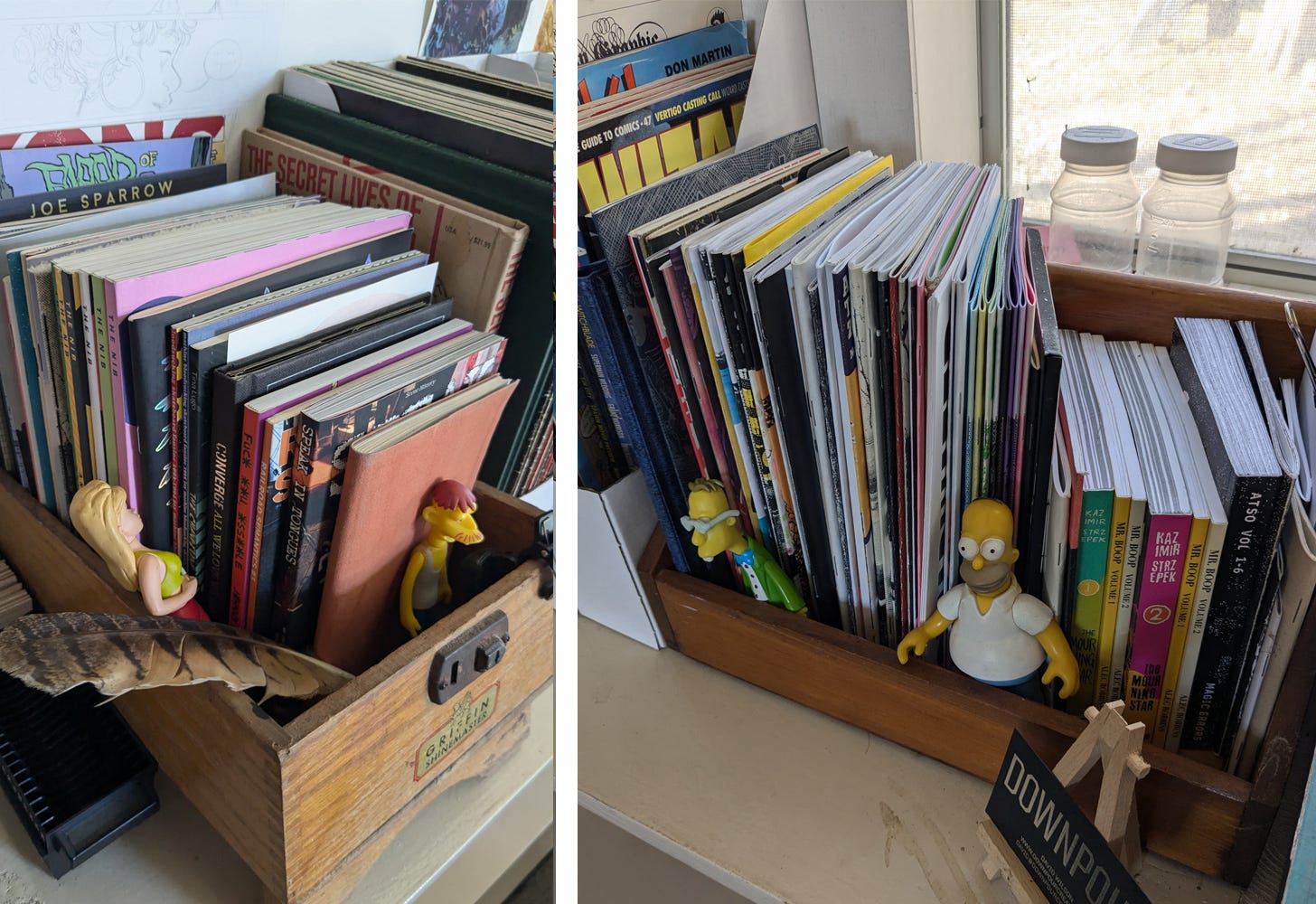
Above: My zine shelves.
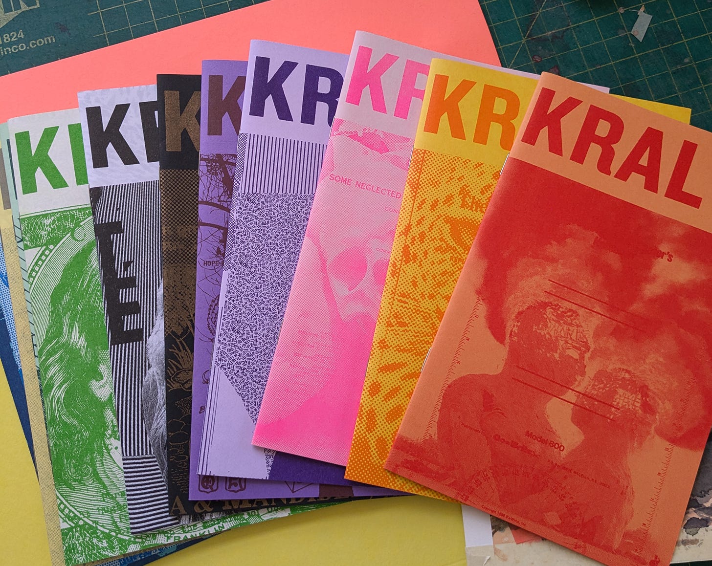
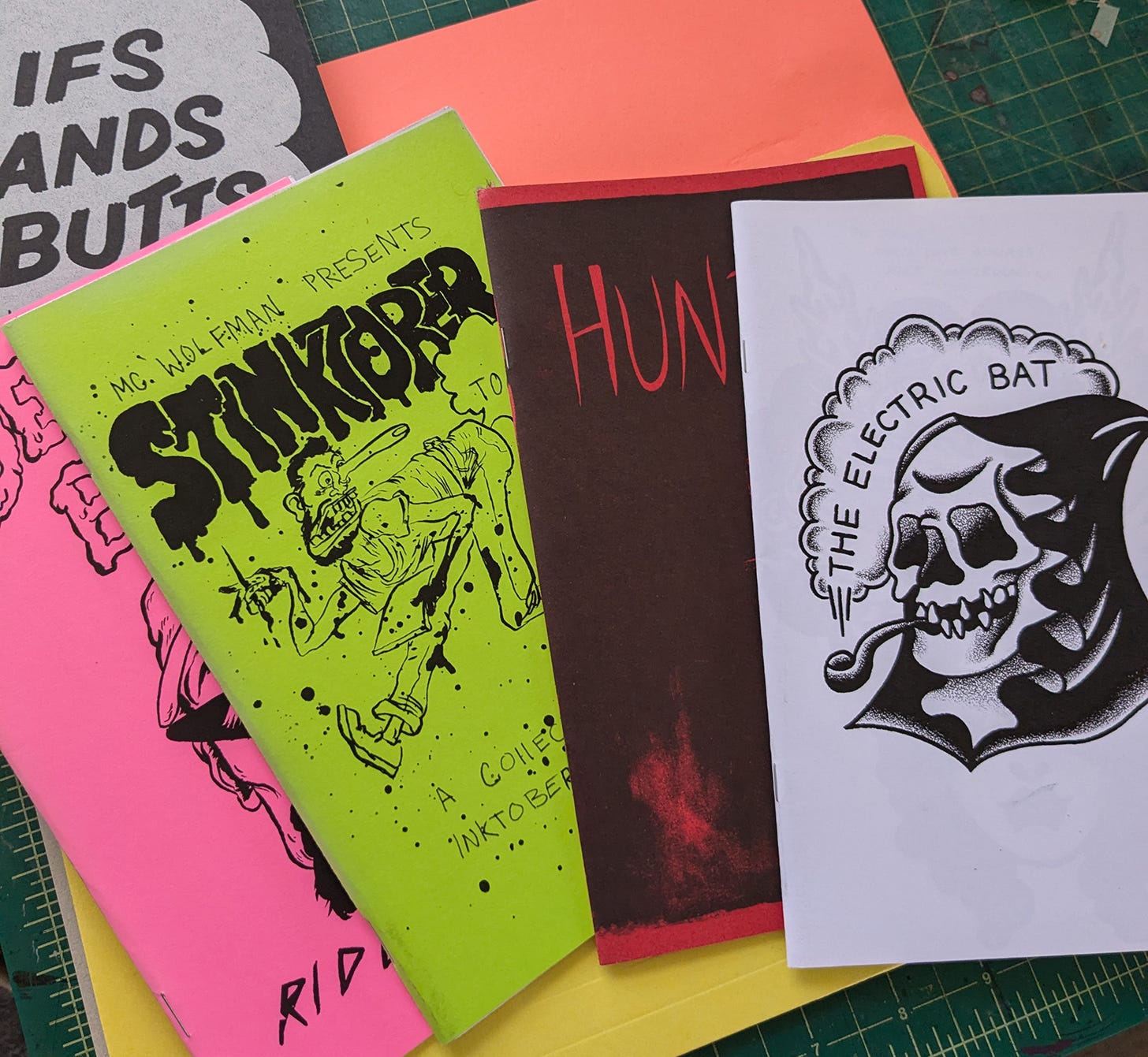
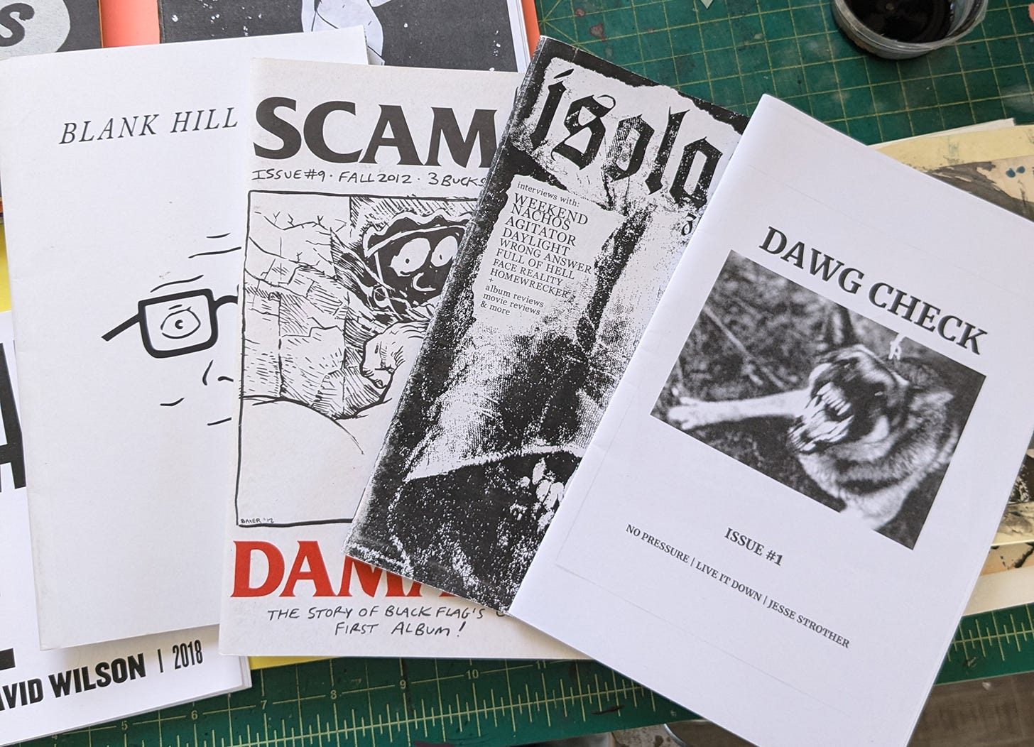
Above: Zines I’ve picked up along the years.
Beyond the humble zine, it's important for me to subscribe to magazines. It keeps me connected (book recommendations, movie reviews, culture updates, deep dives into politics, entertainment, and history), and the subscriptions also help employ creatives—writers, photographers, editors, illustrators, and designers. I try and get all my subscriptions from DiscountMags.com because they're cheap, and I read once that subscriptions allow the magazine to charge more for advertising so they can pay their employees more (can someone confirm that?). So, $6 for six issues of Wired is an amazing steal!
My list of subscriptions goes as follows: Esquire, GQ, Bon Appetite, Food and Wine, Variety, Vanity Fair, Wired, Mother Jones, New York Mag, W, Vulture, Thrasher, Metro. I also get Nat Geo for Kids and The Week For Kids for Norah and Fiona (my kiddos). They read them in the car and we read them together before bed. They love the short facts and pictures. They're big readers anyway, but the magazine opens them up to things I might not have considered introducing them to. It’s a great way of showing them news can be presented off a screen.
In a world where content now comes "free," I think funding journalists who are out digging for the truth in their respective fields deserve our money and time. I don't want to go through the world not knowing anything around me, not learning about the world I live in. Magazines help with that. They also help me be a better creative—keeping mental tabs on illustration, type choices, layouts, and photography. It's also how I find inspiring artists like Mike McQuade.
Art by Mike McQuade.
It's also how I found some of my favorite recipes, which are now priceless to me. What would Misty and I do without Steak Wraps from Bon Appetit? (I know the recipe can be found online, but I never would have found it online… I had to see it in ink, on paper, from my mailbox, for which I paid a subscription fee.)
I don’t know. Let’s make more zines. If you do… make multiple copies of it and let me know so I can buy one. :)
Making stuff.
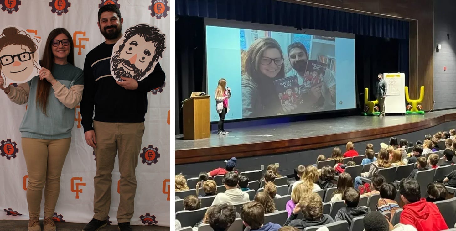
Misty and I have been out and about this month (Lake Erie Ink Comic Con, and a few school visits). I LOVE talking with kids and librarians about Play Like A Girl. It’s the most rewarding part of making comics—the people who relate to them, enjoy them, see themselves in the story, get hooked to reading via a graphic novel. Presenting and hanging out with readers is always a wonderful time. One school even made us our own “fat heads”!
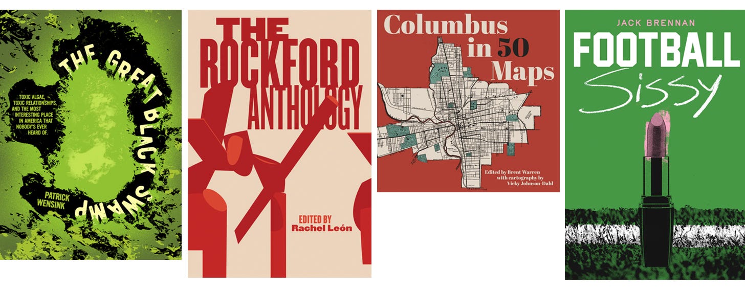
Another thing I love is designing book covers for Belt Publishing. Here are some of the most recent ones I got to work on. I always appreciate the trust Belt and Belt’s authors give me when creating the faces for their work.
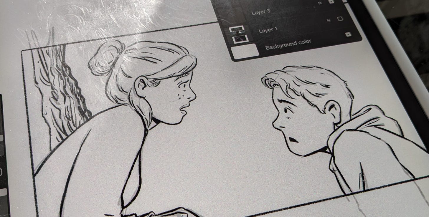
I turned in my art for Soulmates (my YA graphic novel slated to publish in Spring 2026)! After one last round of revisions, it is in the hands of editors and art-directors and proof readers and… oh boy… fingers crossed it’s good!
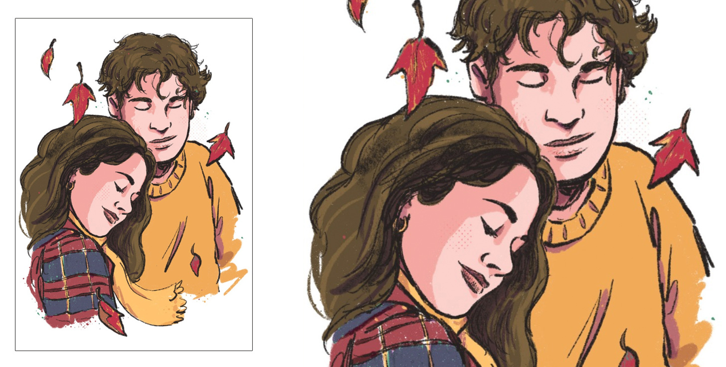
Speaking of books… Misty has her first NOVEL, Falling Like Leaves, coming out this September, so I whipped up a little art print for her pre-order campaign.
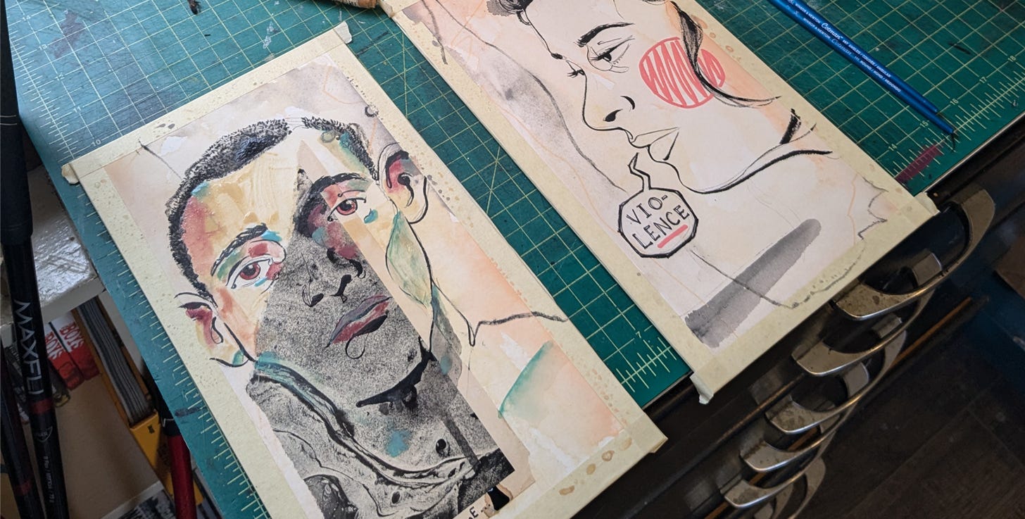
And whenever the weather is nice at night I’ve been heading out to the studio and throwing some paint around for some new “fine art” style pieces. I put on the tunes really loud and kind of make a mess on crescent board and see what happens. I’ve given myself a few limitations (portraits, a color scheme, and collage aesthetic) but other than I just let the mess happen and wait to see if the results are any good.
Sharing stuff.
Tunes…
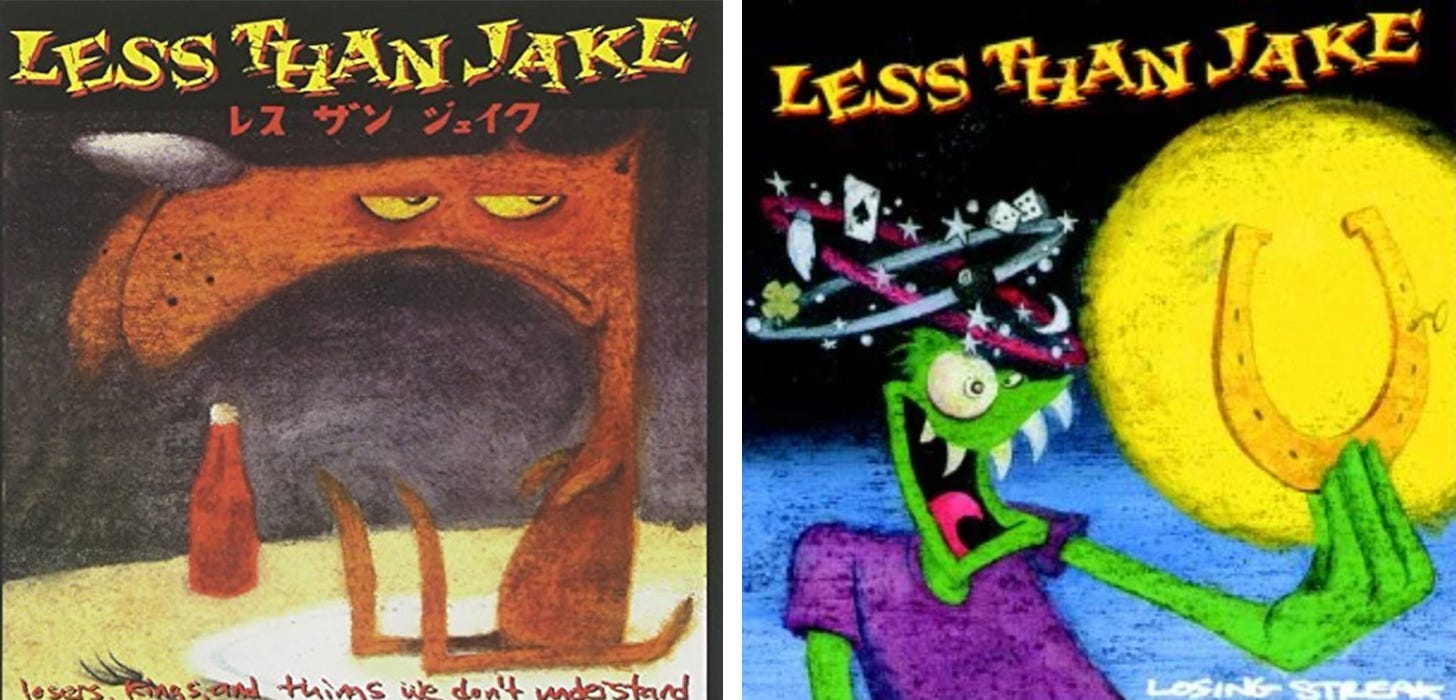
It’s getting warm out here in Ohio, so that means punk music in the van. And sometimes that punk music has a little more ska. Less Than Jake’s Losing Streak was one of the first punk albums I ever owned. I remember they were also one of the first bands I heard use the word “fuck” a lot, and at that time, in middle school… hell yeah.
Watching
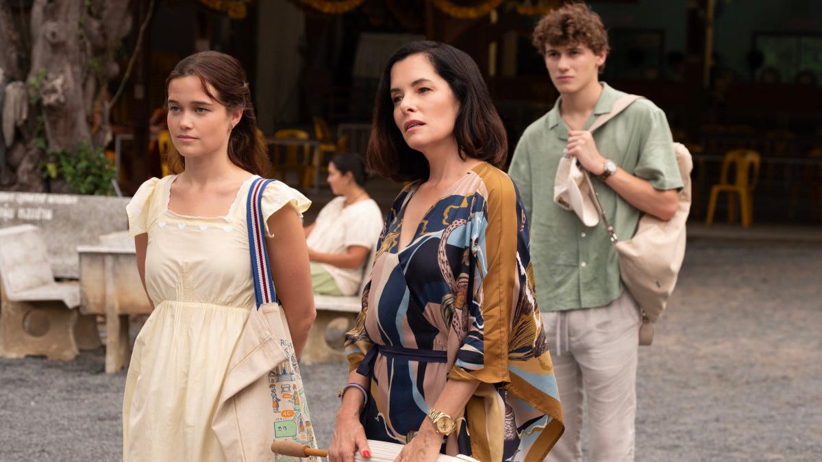
The White Lotus is back for season 3 and is as awkward as ever but so much fun. Parker Posey as Victoria Ratliff… brilliance.
I revisited the documentary Art and Copy. I watched it when I was younger and that’s where I fell in love with George Lois and his contempt for corporate media. Boy, has the world changed. I want to say that I hate advertising—the idea of lying or exaggerating culture/ideas to sell product. But when I watched the movie this time around it pumped me up in the same way it did when I was younger. It made me remember the power of what being creative holds. It had me thinking of how much I love great advertising (isn’t that the point?) The jingles… the toy commercials… ad campaigns for movies… magazine covers… Nickelodeon bumpers before the main cartoons. Maybe I’m just jaded to our new advertising landscape where *most* everything is trite and derivative and thrown in my face at every corner I turn? (Maybe advertising has always been bullshit and finding true creative gems is always the solution…) All this probably bleeds into a bigger conversation about what type of creative output our culture currently values…

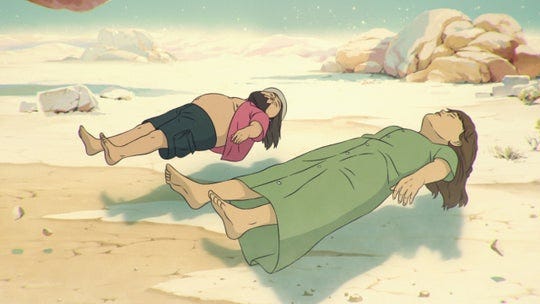
I also put down a ton of episodes of Common Side Effects and The Boondocks. More adult animation NOW! Common Side Effects is brilliant, funny, heartfelt, thrilling, and animated beautifully. It pairs humor with drama perfectly. The Boondocks holds up now more than ever — “Grandad, you can’t tame the white supremacist power structure with cheese!”
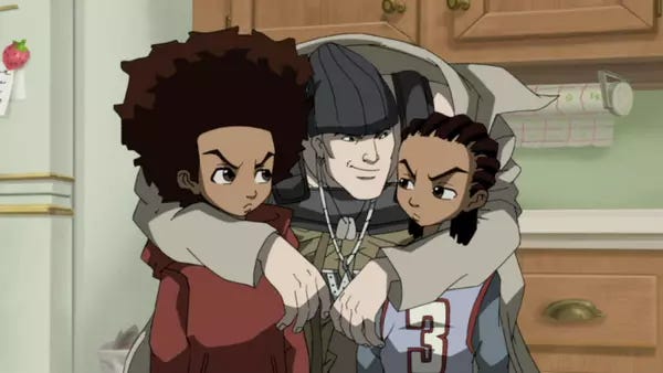
Above: Common Side Effects on Adult Swim. Below: The Boondocks.
Reading
I’ve been reading On Locations by Mark Kamine. Mark goes into detail working as a location scout for Hollywood but mostly his time spent on the set of The Soprano’s. It’s a great, quick read about the industry with small glimpses into the day to day of someone on set dealing with producers, actors, and directors. Highly recommend for anyone interested in the tv/film production.

Hell yeah! Thanks for the discountmags tip!!